glucopy.plot.mean#
- glucopy.plot.mean(gf: Gframe, add_all_mean: bool = True, add_all_std: bool = True, add_std_peak: bool = True, add_quartiles: bool = False, height: float = None, width: float = None)[source]#
Plots a line plot of the mean and standard deviation of fixed intervals of 15 minutes
- Parameters:
gf (Gframe) – Gframe object to plot
add_all_mean (bool, default True) – If True, the mean of all the data will be added to the plot
add_all_std (bool, default True) – If True, the standard deviation of all the data will be added to the plot
add_std_peak (bool, default True) – If True, the peaks of standard deviation will be added to the plot
add_quartiles (bool, default False) – If True, the quartiles of the data will be added to the plot
height (float, default None) – Height of the plot
width (float, default None) – Width of the plot
- Returns:
fig – Figure object
- Return type:
Examples
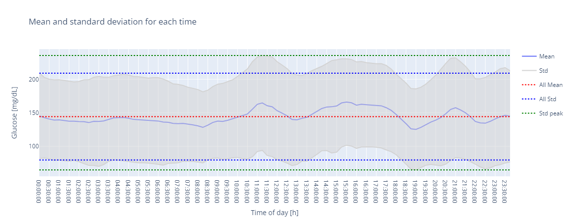
Plot the mean and standard deviation of each interval of 15 minutes (default)
In [1]: import glucopy as gp

In [2]: gf = gp.data('prueba_1')

In [3]: gp.plot.mean(gf)
Out[3]:
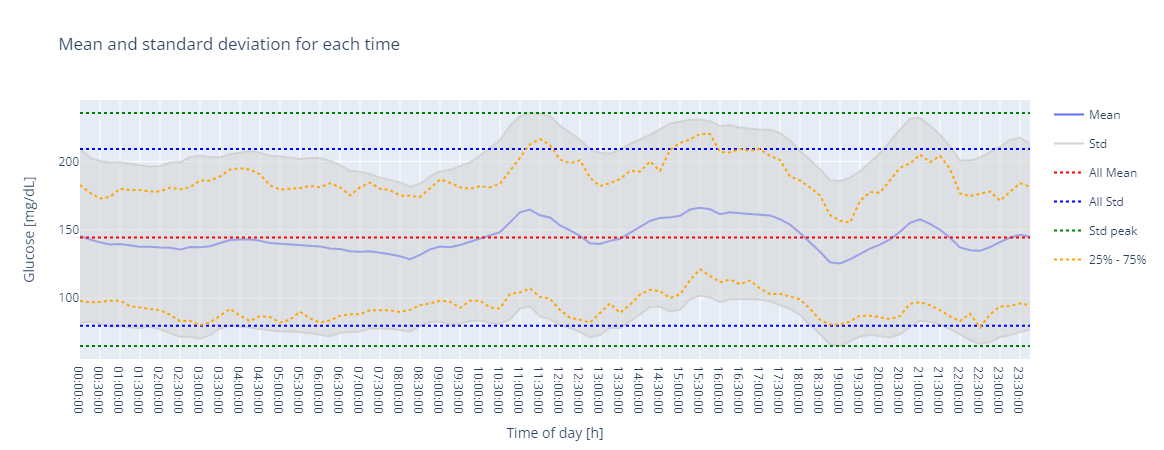
It is posible to add the quartiles of the intervals
In [4]: gp.plot.mean(gf, add_quartiles=True)
Out[4]: