glucopy.plot.tir#
- glucopy.plot.tir(gf: Gframe, interval: list[int] = [70, 180], height: float = None, width: float = None)[source]#
Plots a line plot of the CGM values in the Gframe object separated by time in range for each day
- Parameters:
gf (Gframe) – Gframe object to plot
interval (list[int], default [70, 180]) – interval to highlight
height (float, default None) – Height of the plot
width (float, default None) – Width of the plot
- Returns:
fig – Figure object
- Return type:
Examples
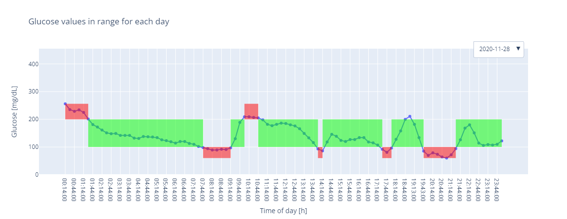
Plot the CGM values for each day in the Gframe object highlighting the values in the interval [70, 180] (default), and clicking on the second day on the dropdown menu
In [1]: import glucopy as gp

In [2]: gf = gp.data()

In [3]: gp.plot.tir(gf)
Out[3]:
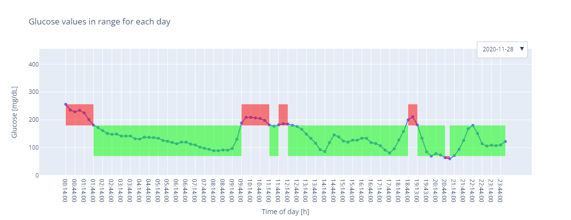
Plot the CGM values for each day in the Gframe object highlighting the values in the interval [100, 200], and clicking on the second day on the dropdown menu
In [4]: gp.plot.tir(gf, interval=[100, 200])
Out[4]: